Predicting The Future
One of the core concepts in Data Science is predictive analytics. You can predict the future – what’s not to love? How powerful is that? Today we’ll dip our toes in the ocean that is predictive analytics by starting with the linear regression line. By the end not only will you talk shop with the stats nerds in your office, you’ll be able to wow your friends at parties*
We’re going to learn 3 key concepts:
- What a regression line is
- How you make the best regression line using sum of squares technique
- How you can know how effective your regression line will be
Although I’ll be simplifying here I don’t want to downplay the complexity of doing this in real life. Building these models on a daily basis requires significant, graduate level statistics and it’s not uncommon to see PhD’s doing this work. But we don’t let ourselves getting intimidated at Amateur Data Science because an understanding of the basic concepts is within the grasp of everyone. So let’s dive in!
A Simple Example
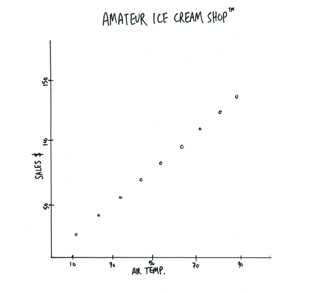
Let’s start with some easy data. Perhaps data about ice cream sales related to air temperature.
You can see that these dots lend themselves to being connected by a straight line. With that line you can now estimate how much ice cream will be sold at various temperatures. Pause here and congratulate yourself because if you understand this paragraph you understand regression lines!
A Harder Example
But…it’s not this easy. Your real data will never align so nicely to a straight line. Even a little variety will make drawing the line much more difficult. Look at this data and tell me which is the correct regression line. Is it the red line or the blue line? Or some other line not even shown?
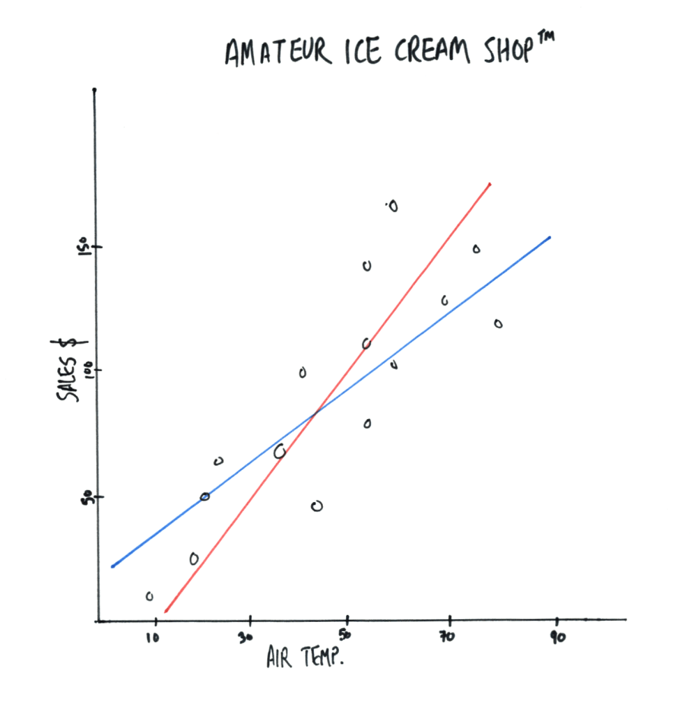
Meet our first statistical term: Sum of Squares. The way you draw the most accurate regression line in the example above is to draw a line that minimizes the total distances between each point and the regression line itself. That’s a mouthful so let’s use the blue line as an example:
- Take the first data point and measure the vertical distance to the blue line.
- Do this for the next point. And so on for all of them. At the end you’ll have a total number.**
- Repeat this for the red line. The line with the lowest number wins.
Here’s the catch, your ‘winning’ line is only the best of the two we drew. You need to repeat the drawing/measuring steps above for every possible line that exists. This can be done by hand, at least in theory, but modern tools can do this with only a few lines of code for you.
‘R-value’ is how you know
You’ve got the best line, but is that line any good at predicting the data? No matter how scattered your data you can always create a regression line but that doesn’t mean it’s useful. This is where we need our second term: r-value. The r-value of a regression line is a measure of how well the line predicts the data. Conveniently it’s a percentage between 0 and 100 and a higher value means there are less unknown reasons driving our result.
Let’s go back to our ice cream shop and look at that first image, where all the data is exactly on the line. Let’s imagine that the only thing affecting ice cream sales is the air temperature. By definition, the r-value of this line is 100% because the regression line explains all, 100%, of the changes to the data.
But, let’s imagine other factors affect ice cream sales. Maybe it’s hot today, but it’s also raining. Or it’s hot today but the economy has been bad for months. Now we’d get a graph like our second one where the data is more scattered because more things affect it. In this scenario, if you have an r-value of 65% that would tell you that 65% of the variation in this data is caused by temperature, the other 35% is not known.
What good enough?
Unfortunately there is no “good” r-value and you may have scenarios where a low r-value is acceptable or situations where a seemingly high r-value still leaves too much uncertainty. One of the four pillars of data science we defined at the start of this blog is an expertise in your industry or field, which is precisely what’s needed to interpret the above.
Summary
You made it! Regression lines are the core of any conversation you’ll have in data science and now you’ve got the basics. We set out to learn 3 things today:
1) What a regression line is
It’s a line drawn through a set of data points that can be used to predict where other (future) data points may lie
2) How you make the best regression line using sum of squares technique
You just measure from each data point to the regression line and add it all up, your regression line will be the one line (from all possible lines) that has the smallest summation.
3) How you can know how effective your regression line will be
You’ll look at the r-value which tells you how much of the variation in the data can be accounted for in the regression line.
Understanding this building block is going to be important as we go deeper into our statistical lessons. Concepts similar to these are going to reappear and you’ll now be ready with the knowledge of an Amateur!
*Maybe not wow them, but at least make yourself look smart.
**In practice you’ll actually square each measurement and then sum those results, hence the name Sum of Squares.
